
Vivid Opticians is a UK optometry practice that came to me in early 2020 needing a brand, a website, and a way to take bookings without picking up the phone. Then COVID hit. The booking system stopped being a feature and started being the entire product.
01 — Overview
Vivid Opticians is a new optometry business in Newcastle-under-Lyme, UK. The brief, when it landed, was broad — a brand, a full website, social media, the works. By the time we started, lockdown had narrowed it to one question: how do you keep a brick-and-mortar optometry practice running when nobody can just walk in?
A new opticians needed help building a digital presence from scratch. That meant a brand identity, a marketing-grade website, and a social media campaign to support a local launch. Standard small-business package.
The site needed to do three jobs: introduce a new business, list services, and convert visitors into appointments.
COVID arrived weeks into the project. Walk-ins disappeared. Phone bookings became the only way to schedule, which meant longer hold times, fewer bookings, and a reception team handling appointments instead of patients.
The website went from being a marketing site with a bookings page to being the bookings system — and the marketing site supporting it.
02 — The Problem
Customer reviews of competing practices gave me a clean view of what was breaking down across the industry. Three pain points came up over and over — and not just at Vivid’s direct competitors. They’re the friction points that define the whole UK high-street optometry experience.
PROBLEM 01
Patients with confirmed slots were still waiting 30+ minutes in reception. Booking a time meant nothing; it was first-come, first-served once you arrived.
PROBLEM 02
Frame and lens pricing was opaque before the appointment. Patients felt locked in by the time they saw the bill, which drove negative reviews and one-time visits instead of repeat customers.
PROBLEM 03
Every question — "do I need a new prescription?", "can I order contacts?", "will this frame suit my face?" — required an in-person visit. During lockdown, that meant the practice couldn’t serve anyone.
The Goal
Pick the one feature that solves a real problem. Build everything else around it. For Vivid, that feature was a booking system that respected the patient’s time — and let the practice keep operating when the doors were closed.
03 — Research
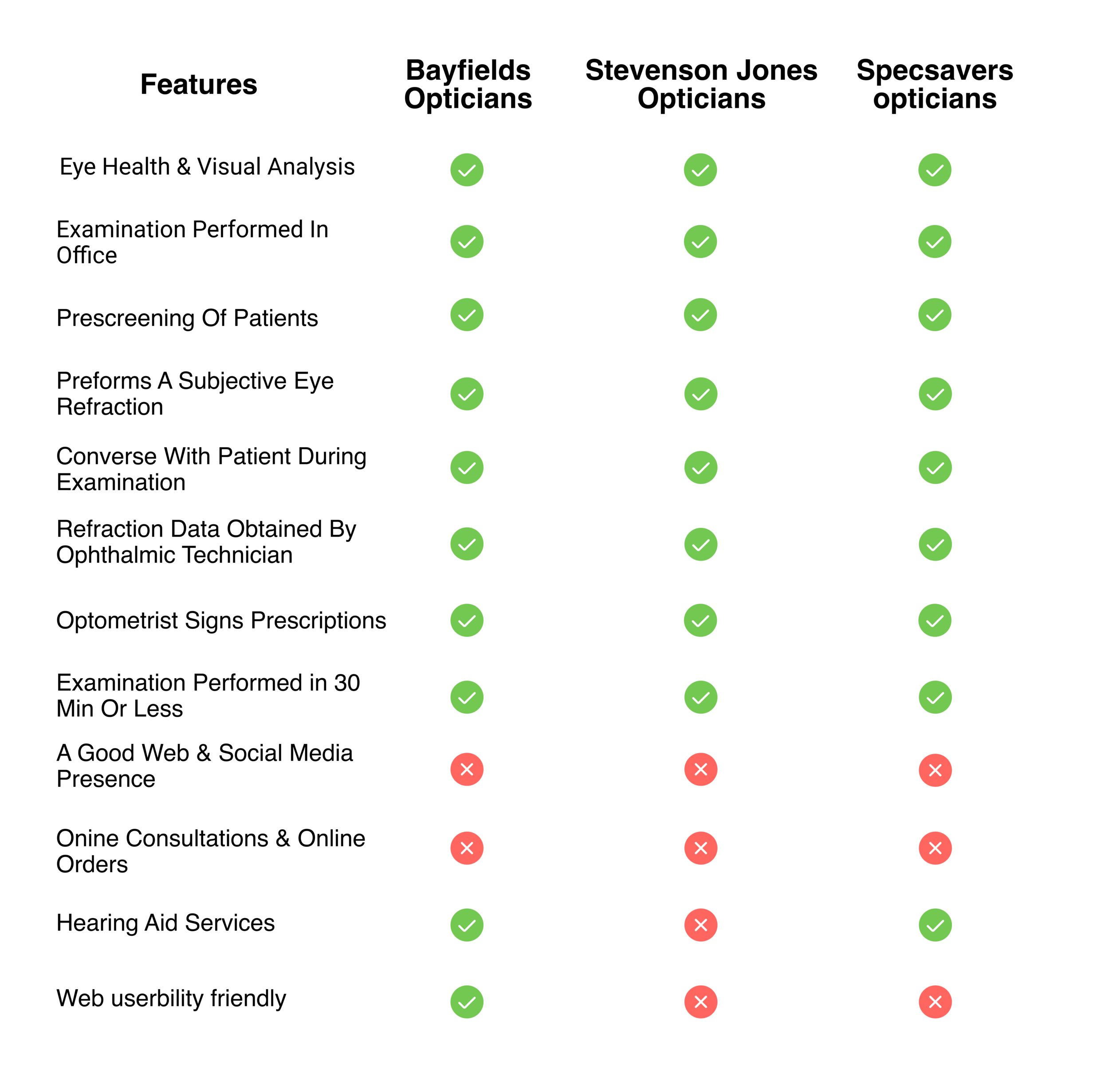
Two parallel research streams: a feature-by-feature audit of nearby practices, and a deep read of their customer reviews. The first told me what the industry baseline looked like. The second told me where the baseline was failing real patients.
I scored five regional optometry practices on web presence, online booking, social media activity, content depth, and ease of contact. Most had a website. Almost none had a real booking system — just a phone number and an email address.
That was the gap. A practice that took bookings online would be the only one in their immediate market doing it.
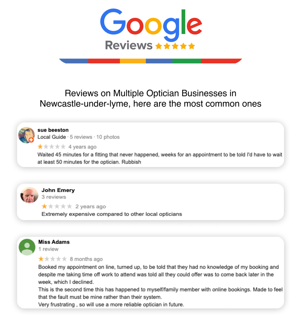
Pulled Google reviews for the same five practices. Patterns emerged fast: complaints clustered around waiting times, surprise pricing, and the inability to get answers without scheduling a full appointment.
The reviews were a free user research panel. Real complaints, real language, sorted by what mattered most to patients.
04 — Persona & Journey
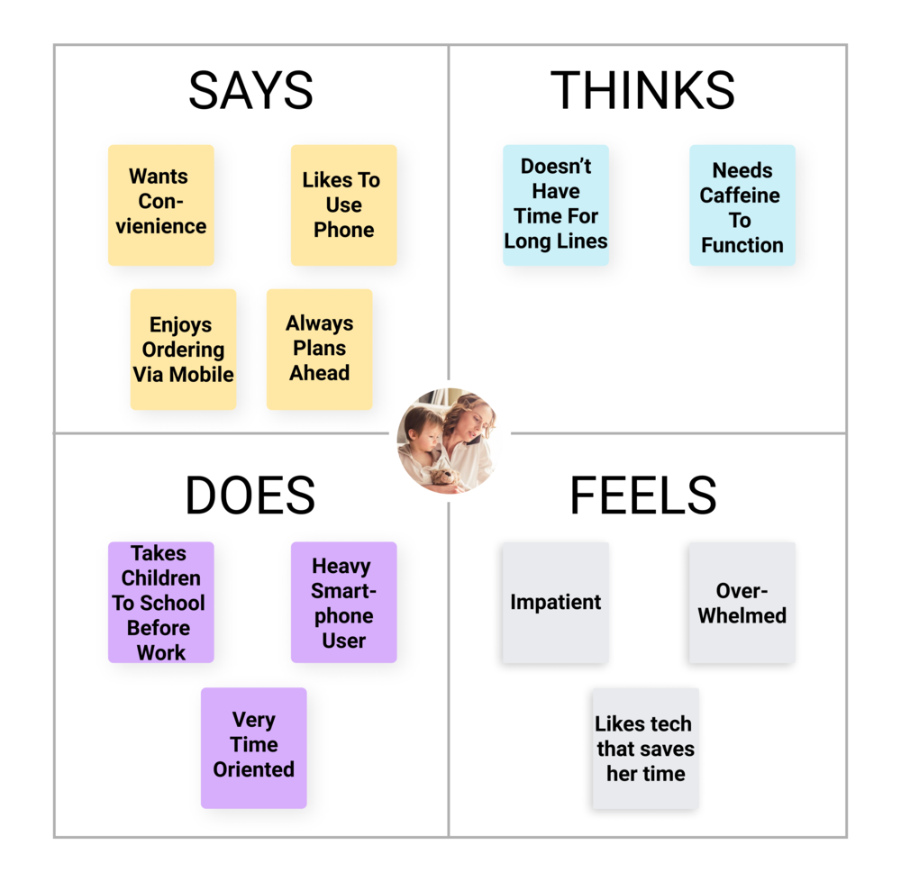
User research is more useful as one specific person than as five blurry ones. Kendra is a composite persona built from the review patterns and the practice’s existing patient demographics — busy, time-poor, decisive once she has the information she needs. Every screen had to answer the question: would Kendra book today, or click away?
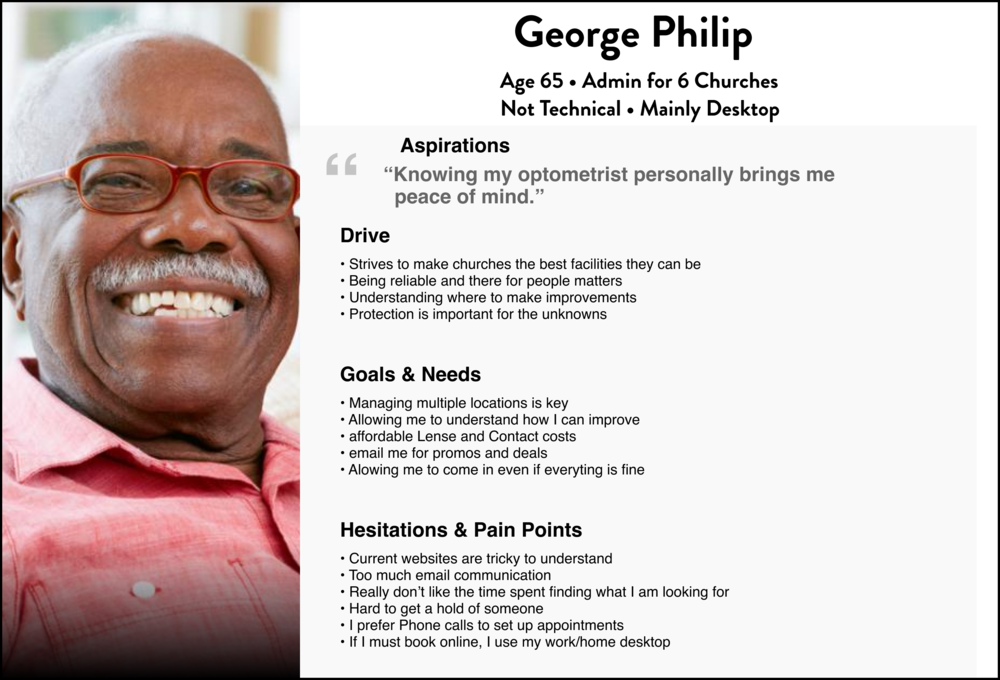
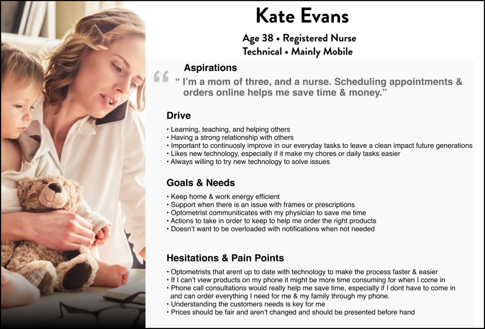
Kendra is 28, balancing work and family. She values convenience and dislikes waiting. She researches before she commits — and abandons anything that requires a phone call when a click would do.
For her to book Vivid, three things needed to be true on the first visit to the site: she could see prices, she could pick a slot that fit her week, and she could do it from her phone in under two minutes.

05 — Solution
Each solution maps to one of the three problems from section 02. The booking system was the hero feature; the other two existed to support and extend it.
01
Patients pick from real available slots based on staff and resource availability — not just a generic time grid that gets overwritten on arrival. The system also reserves a buffer between appointments so a delayed patient doesn’t cascade into the next four bookings.
02
A budget chart on the eyewear pages showed clearly which frames sat at the affordable end and which were premium — before the appointment, not after. Patients arrive informed; the practice gets fewer abandonment moments at the till.
03
A short call after booking, before the in-person visit. Patients describe what they need; the practice prepares the right frames, paperwork, and exam time block. The in-person appointment goes from generic to specific. During lockdown, this also became the lightweight version of remote consultation.
06 — Wireframes
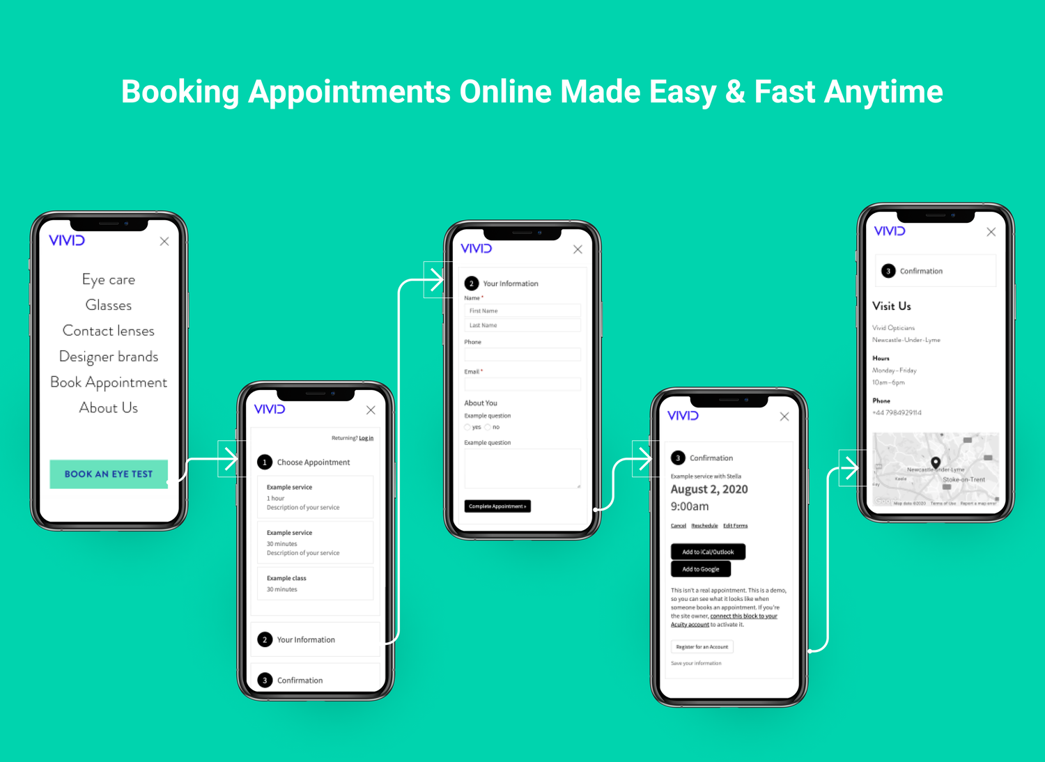
Everything important happens in three steps — landing, picking a slot, and confirming. The rest of the site exists to push visitors into screen one. Wireframes focused on the booking journey from the start, with the marketing pages mapped out around it.
01 — Home
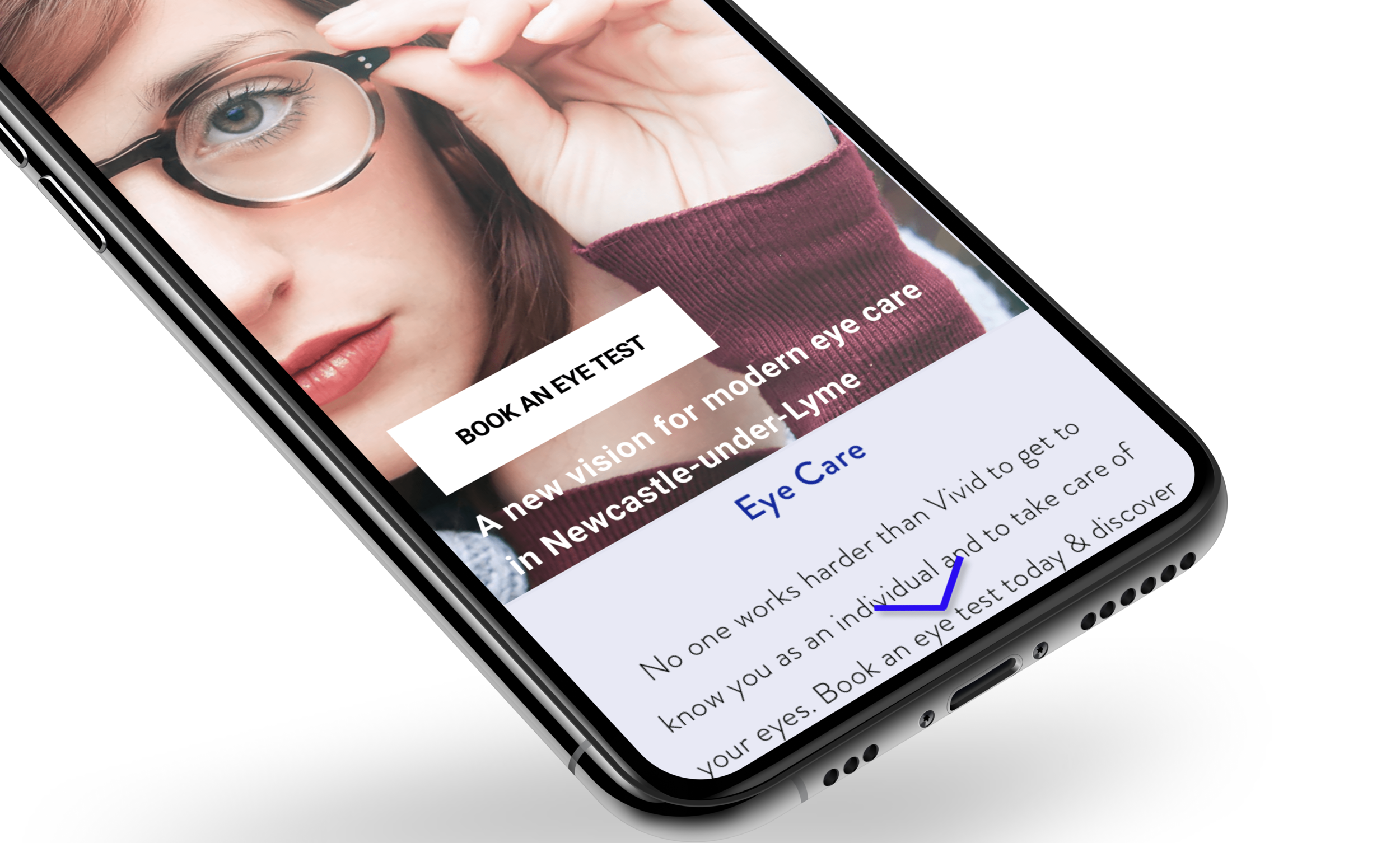
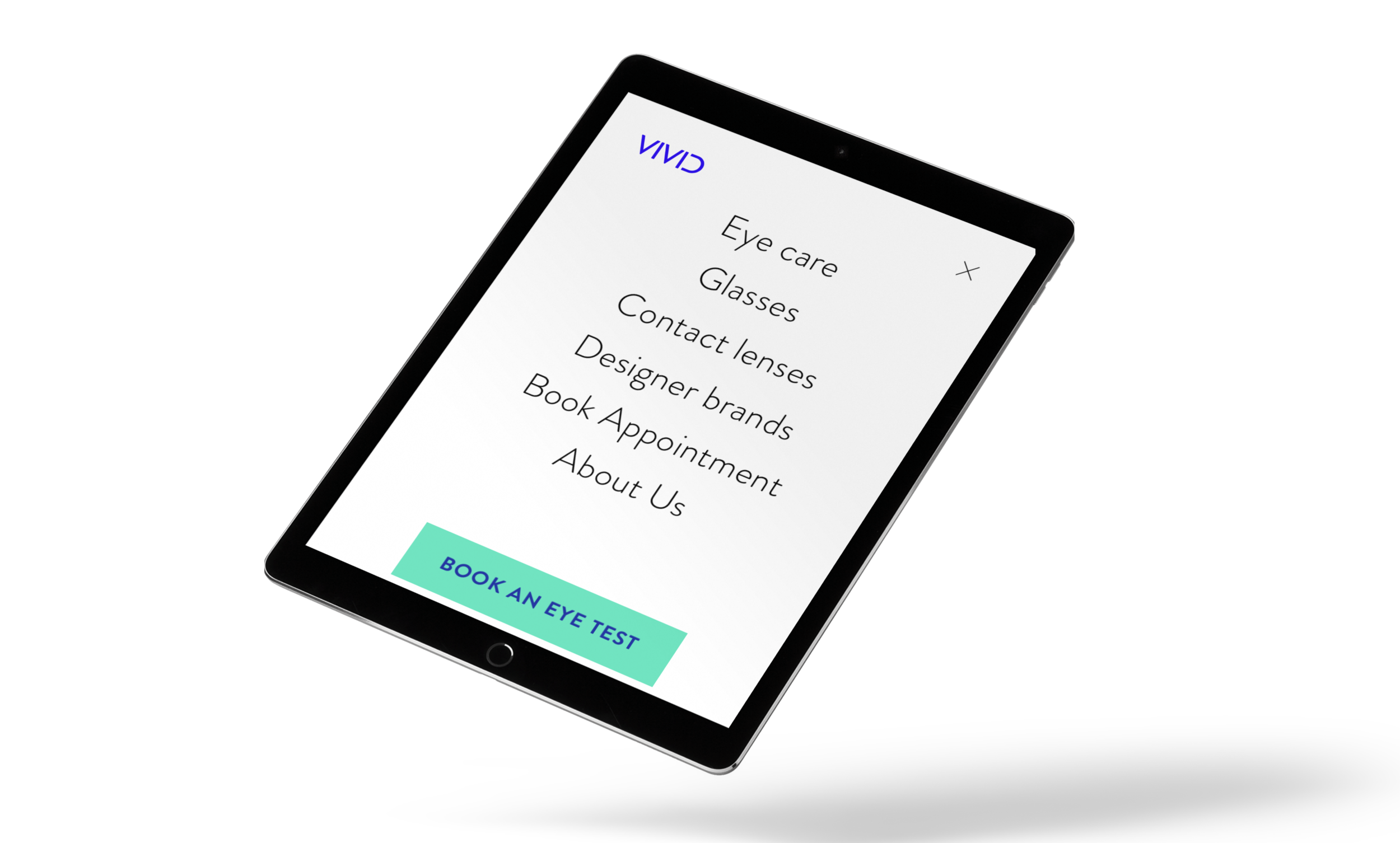
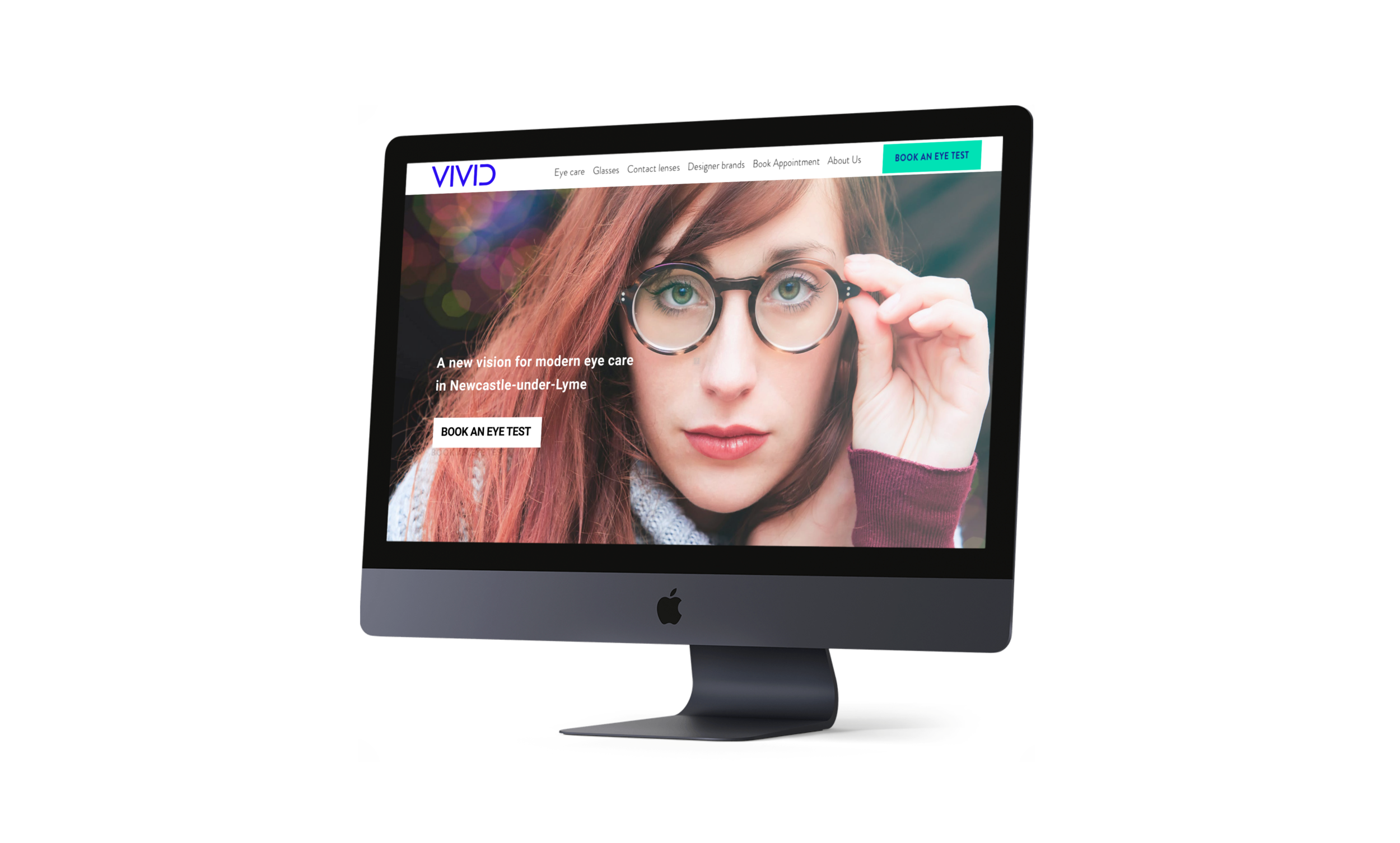
Hero, primary CTA, services preview, transparent pricing strip — booking is the first thing visible above the fold.
02 — Pick a slot
Real availability per staff and resource. Greyed slots are taken; the buffer rule prevents cascade-delays into the next four bookings.
03 — Confirmed
Confirmation, booking summary, and the pre-appointment phone call — turning generic visits into specific ones.
Wireframes redrawn for this case study to walk through the booking flow as designed.
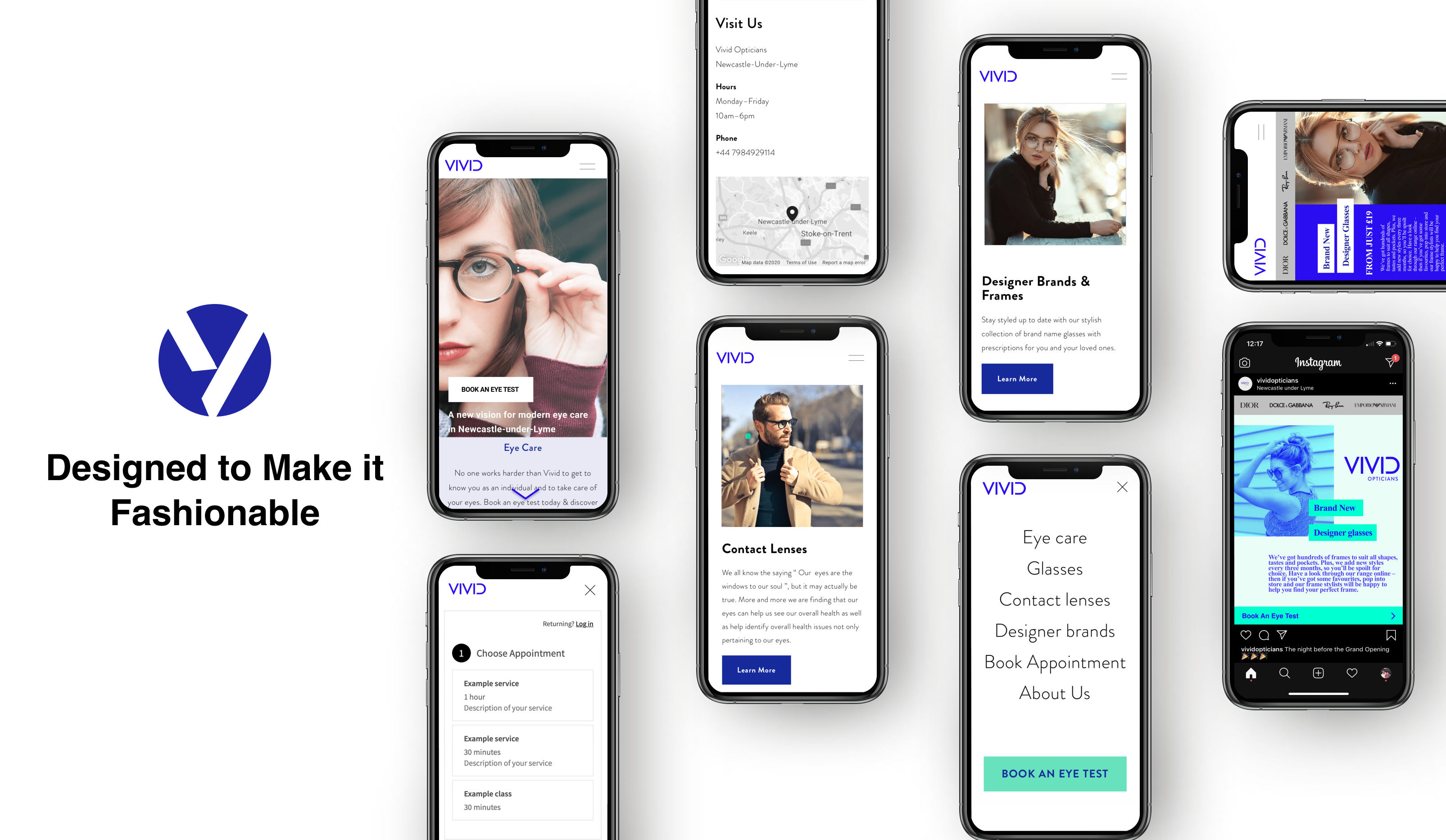
07 — UI Design
Started on mobile and scaled up. Most patient traffic for a small local practice is people Googling on a phone — "opticians near me," "eye test booking," "contact lenses Newcastle." Designing for the phone first meant the booking flow stayed fast and frictionless.
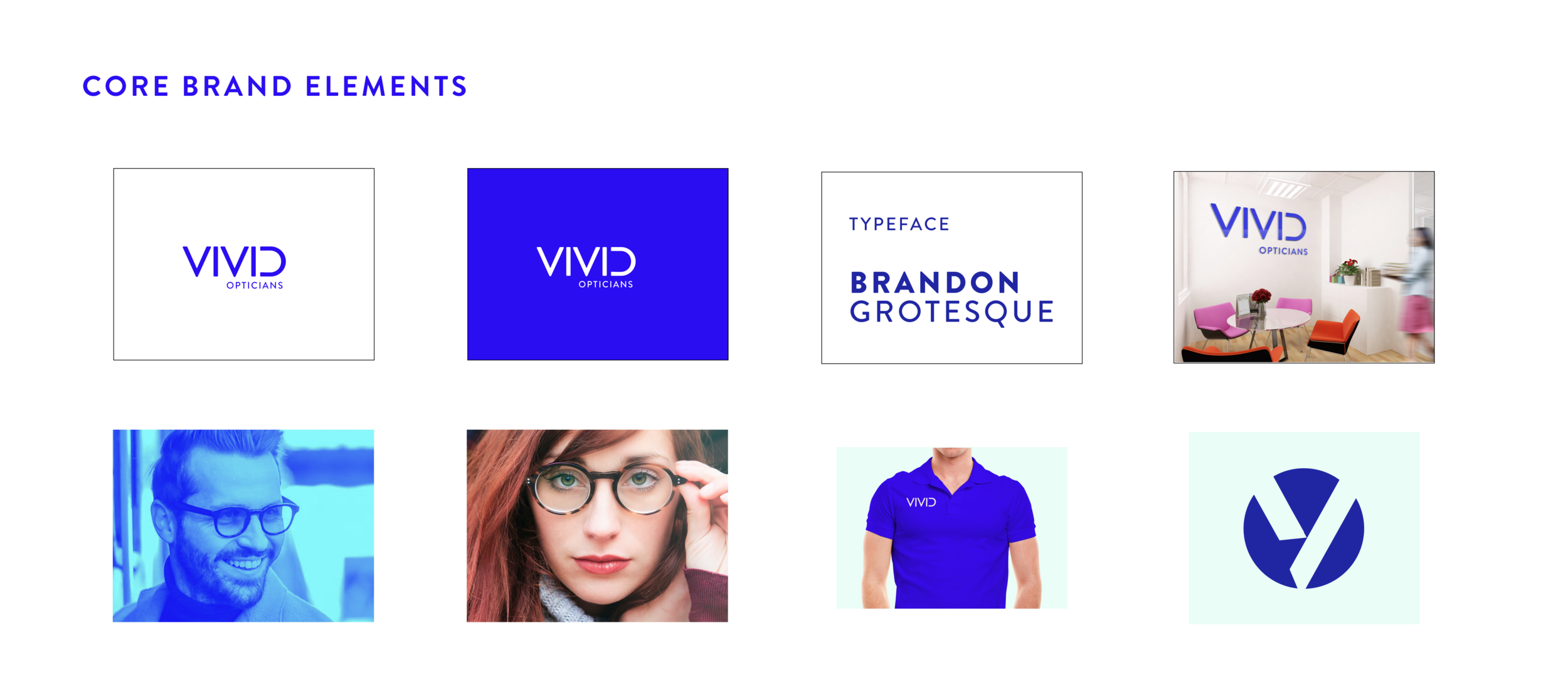
Clean, modern, slightly fashion-forward. The previous opticians in the area read as clinical or dated — Vivid had to look like a place people would want to be seen in, not just somewhere they had to go for an eye test.
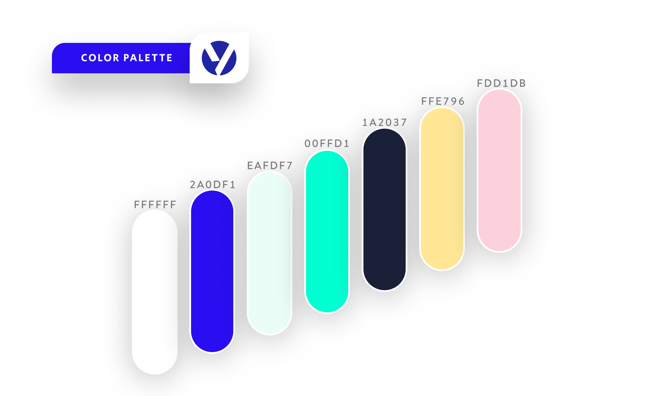
The colour palette leans into a warm neutral base with a single accent, paired with editorial typography that reads as a contemporary brand instead of a healthcare provider.
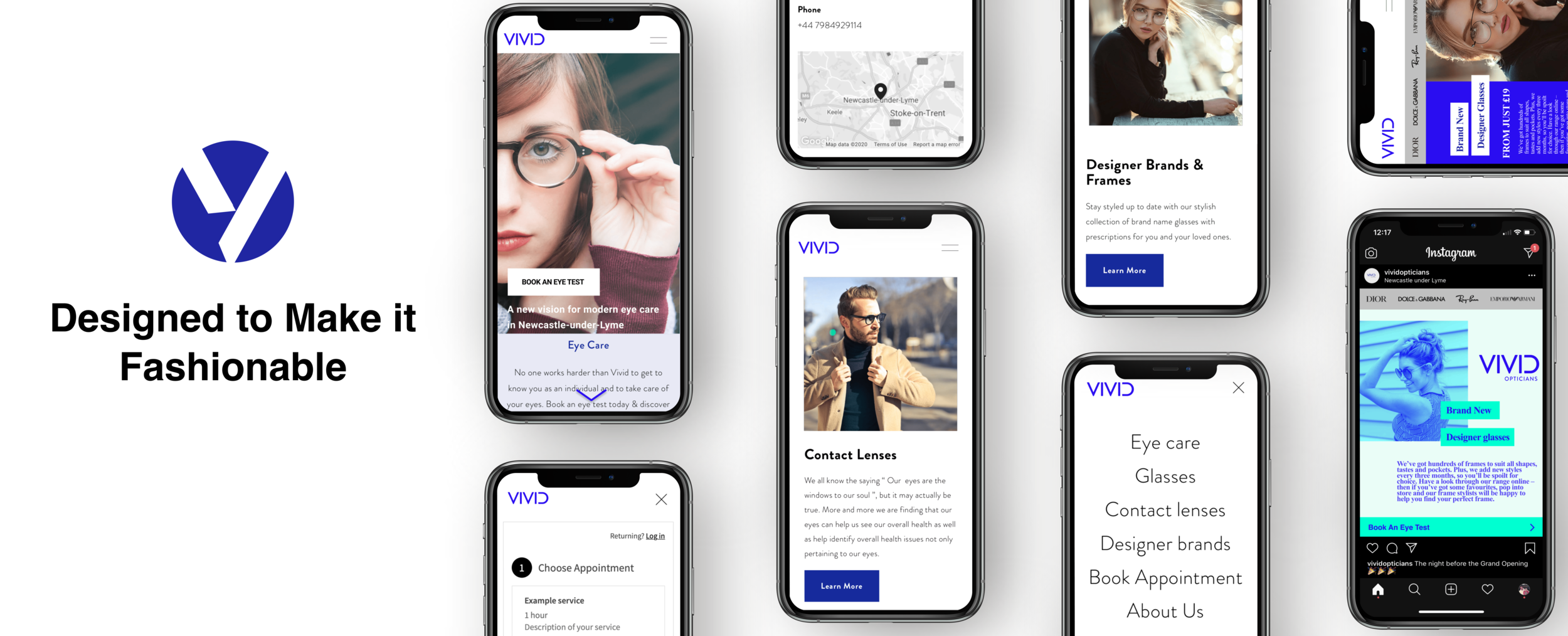
Three steps, two minutes. Pick a service, pick a time slot, leave contact details. The slot picker shows real availability based on the practice’s actual diary, and a buffer between appointments stops the cascade-delay problem the competition couldn’t solve.
Confirmation goes by SMS and email. The pre-appointment call gets scheduled automatically as a follow-up.
08 — Social
A social media campaign supporting the local launch — same brand system, same palette, same booking-first message. Every post pointed back to one CTA: book online in two minutes.

09 — Takeaway
The original brief had a dozen deliverables. The lockdown clarified which one mattered. A small practice doesn’t need a marketing website with a booking page bolted on — it needs a booking system with a marketing website attached. Once the booking system was clearly the hero, everything else — brand, content, social — got easier to design because each decision answered the same question: does this make it easier to book?
What I’d carry forward
For small businesses with broad briefs, the design work isn’t deciding what to build — it’s deciding what not to build first. Booking-first thinking, mobile-first execution, and pricing transparency aren’t industry-specific. They’re the baseline for any local service business that wants to convert phone calls into clicks.